Were you ever given the assignment to create a new look and feel of a desktop application or web app, but didn’t know where to start? I found myself staring down a web application with four buttons strategically placed randomly on the screen. My job is to come up with a design that is both unique and inspiring as well as functional; where do I start? In this article, I will discuss building a UI from start to finish.
Content, Content and More Content

So here we are, you have a screen with four buttons; how do we turn this into a working functional and aesthetically pleasing design? The first thing we need to do is create content. Let’s take a deeper dive into the types of content one can gather.
- Verbiage
- Images / Graphics
- Typography
- Colors / Shapes / Textures
- Grouping
- Animations
Verbiage
Word choice is a big part of designing a UI. It gives the user necessary information, but more importantly for you, the designer, it provides more room to play with design. Try taking the text off the button and placing it beside the button. Add a description under each button name describing the purpose for clicking on the button. You have now given a new dimension to your UI.
Images / Graphics
Images can be a way to remove white space. If there is lots of empty space on the screen, one can use images, icons and other forms of graphics to fill this space. Try incorporating in the now empty button with an icon that matches its purpose.
Typography
When filling white space, typography can be your best friend. You can turn text into art in your design. Experiment with different font-families, text size, and placement. There is no reason verbiage has to be horizontal. Play with different directions such as vertical.
Colors, Shapes, and Textures
Use of different colors, shapes and, textures can help create the visual separation of content. It will assist the user in where to look. Draw the users eye to the portion of the screen that will give them what they desire. Use shapes in the background to add a bold look. Layer shapes and textures to create a unique look.
Grouping
Grouping content is another way to fill space. With grouping, the designer must create a menu system to help the user navigate through the grouped items. The navigation bar or section generates a new feature that needs designing. Bingo!
Animations
Add a little animation for visual eye candy. The process of adding animation to the UI creates a complete feeling, so the UI doesn’t feel too static. Don’t go overboard though. Too much animation is not a good thing.
Putting it all Together
Taking some of the suggestions from above, we will start by pulling the verbiage from the buttons and placing it to the right. Then we will add a short description describing the function of each button. Adding a short sentence will inform the user what each button will do without having to click it first.

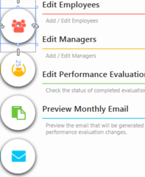
Next, we will focus on organizing the content and use shapes to eliminate white space. We will arrange the buttons vertical while placing a green rectangle to the left. We can now make use of some basic typography and verbiage by adding the name of the application on top of the green area. Finally, we will add icons to the buttons that function as effectively as the text prior. We will also jazz up the buttons by changing them round instead of square.

Round buttons with descriptive icons 
Started a design under the buttons 
Place buttons on top of the design. 
Added Application Name on Green Rectangle. Removed button drop-shadow
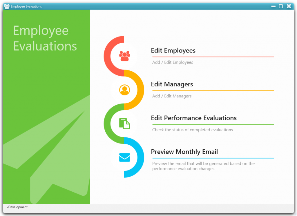
Lastly, we can add animation to the buttons when the user hovers over each. We can add any colorful designs as necessary. I added a flare by incorporating drop-shadow and a funky weaving color pattern. Finish it off by adding images to the green area to cover the last of the empty spaces.

Finished look

On mouse-over icon is colored by the section color
Building a UI from start to finish requires much thought at the beginning of the design phase. Taking the necessary time to gather content makes designing a UI less difficult. Content gathering aids the creative individual in creating something from nothing. Keep these principles in mind as you embark on your next design projects.
